

LinkedIn, But Better

As a Front-End Developer, I have a proven track record of delivering high-quality, user-friendly websites and applications. My commitment to staying up-to-date with the latest industry trends and technologies allows me to bring a fresh perspective and innovative solutions to every project.
Why Redesign?
Yeah, it’s the first question that came to your mind when you saw the thumbnail. Hang on I'll tell you more about it. For starters, One day, while casually scrolling through my LinkedIn feed, I stumbled upon an intriguing post that I wanted to save for future reference. However, when the time came to retrieve it, I was confronted with a surprising realization — there was no “Saved” option in my profile menu. It felt like my post had vanished into the depths of a digital abyss. Despite my best efforts to locate it, I was left perplexed and frustrated.
What do the users think?
It all started with a moment of frustration. I stumbled upon a post worth saving, but there was no “Saved” option. I felt like my post had vanished into a digital abyss. This sparked my curiosity, and I embarked on a user research journey where I found :-
Confusing Content Mix: Connections and followed people mixed up on the home screen.Cluttered UI with too much information on one screen.
Challenging Network Access: Inconvenient navigation to view and interact with my network connections and activities.
Lack of Personalization: Absence of a personalized content feed based on my interests and preferences.
Article Discovery Challenges: Limited visibility of relevant articles, impacting my ability to stay informed.
Job Search Frustrations: Difficulty in finding relevant job listings and managing job applications.
Invisible Stories? The “Stories” feature, is not prominently visible on the home screen. Users have to actively search for a specific profile to view their stories, which may reduce the discoverability and engagement with this feature.
85% of users primarily utilize LinkedIn for networking purposes, emphasizing the platform’s significance in professional connections.
A significant majority of users use LinkedIn daily, underlining the platform’s daily utility and habitual use.
Problem Statement
LinkedIn, a powerful platform for networking and job searching, had its share of UX frustrations. The search function was challenging, the feed cluttered, and it was hard to find information quickly. The problem extended to both users and businesses.
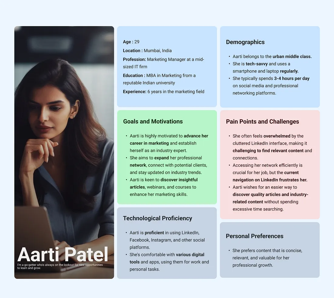
Who uses LinkedIn ?
here’s all you have to know about the User Persona
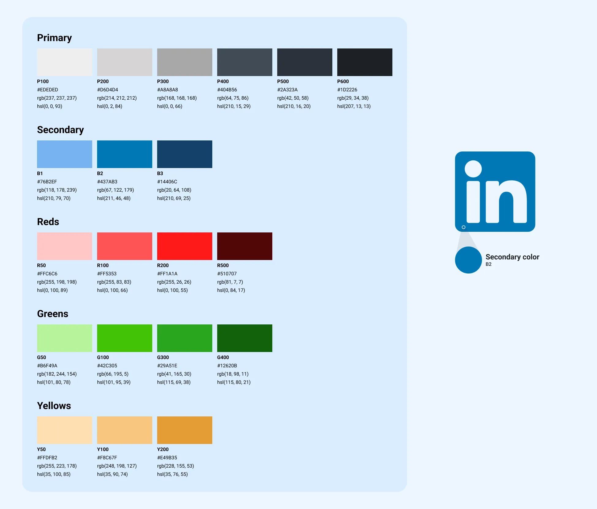
Colors
Fun fact**:** Approximately 81.9% of people use dark mode in apps.
Following the dark mode trend, Blue serves as the secondary color, while neutrals dominate as the primary palette. The brand’s color subtly enhances contrast, elevating the overall aesthetics
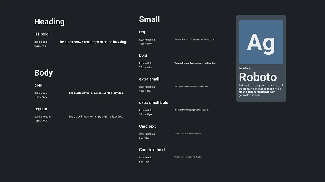
Typography
Another Fun fact: it’s the first typeface designed exclusively for Android. In the typography department, we’ve chosen Roboto, a trusted Android font.
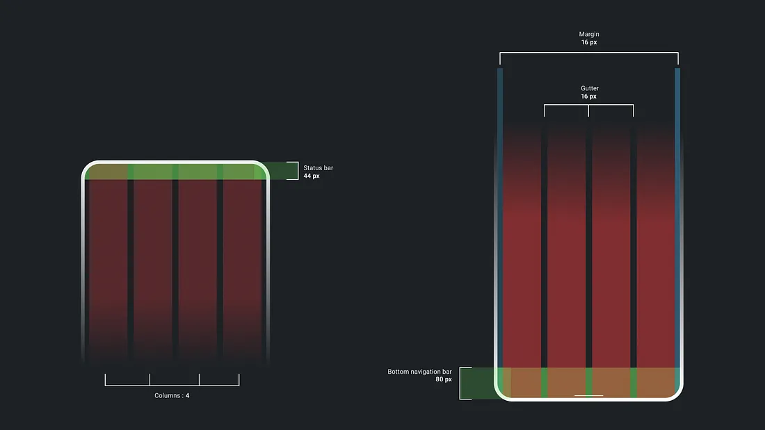
Grids
I went with the flow of Material Design 3 guidelines for the grid layout.
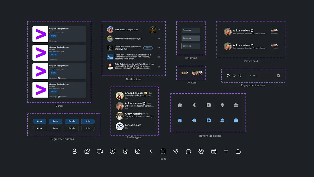
Icons and Components
Consistent Icons and components make the experience better.
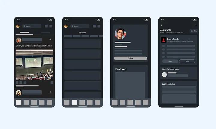
Mid-Fidelity Wireframes
Yes, Mid Fidelity. I feel comfortable working with mid-fidelity wireframes as they are not just a bare sketch of an Idea, they can be called a rough execution of an Idea.
These wireframes aren’t the final polished designs, but they’re more than just scribbles. They’re our design sketchbook, crafted with the user experience in mind. Sharing a minimum of these, I'm sure you are not here for this 😊

The Final Showdown
So yeah, this is what happened after all the work was done. I’ve tried to tackle the problems head-on and now, it’s time to unveil the solutions that will make you go, “Wow!”.
Starting with home, I aimed to make things accessible and less cluttered. As Networking is the main function for which people use LinkedIn, I brought My Network ( Icon to the right of the search bar ) to the home screen, so you can easily stay connected with your professional community. As they say…
Your Network is your Net worth
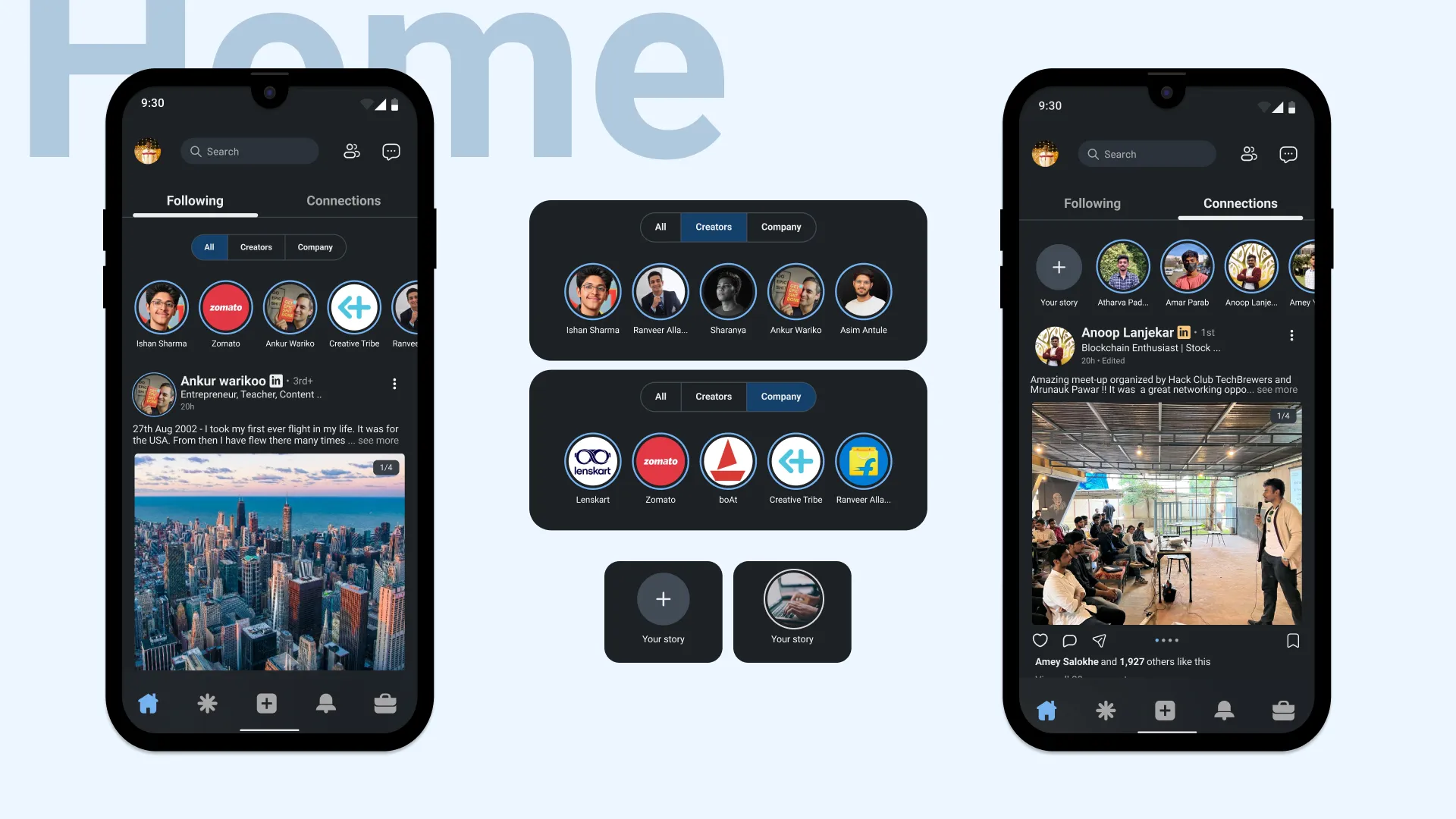
I was shocked to know that LinkedIn has the “ Stories ” feature. I never knew it till I did research for this case study. So I simply brought stories to the home screen and to add more personalization divided them into Creators and Company profile stories after separating Following and Connections. Familiar engagement actions ( Like, share comment ) which look like the ones on Instagram make user friendly as they know it.
Here I followed Jakob’s Law,
Jakob’s Law : Users spend most of their time on other websites, and they prefer your site to work the same way as all the other sites they already know.
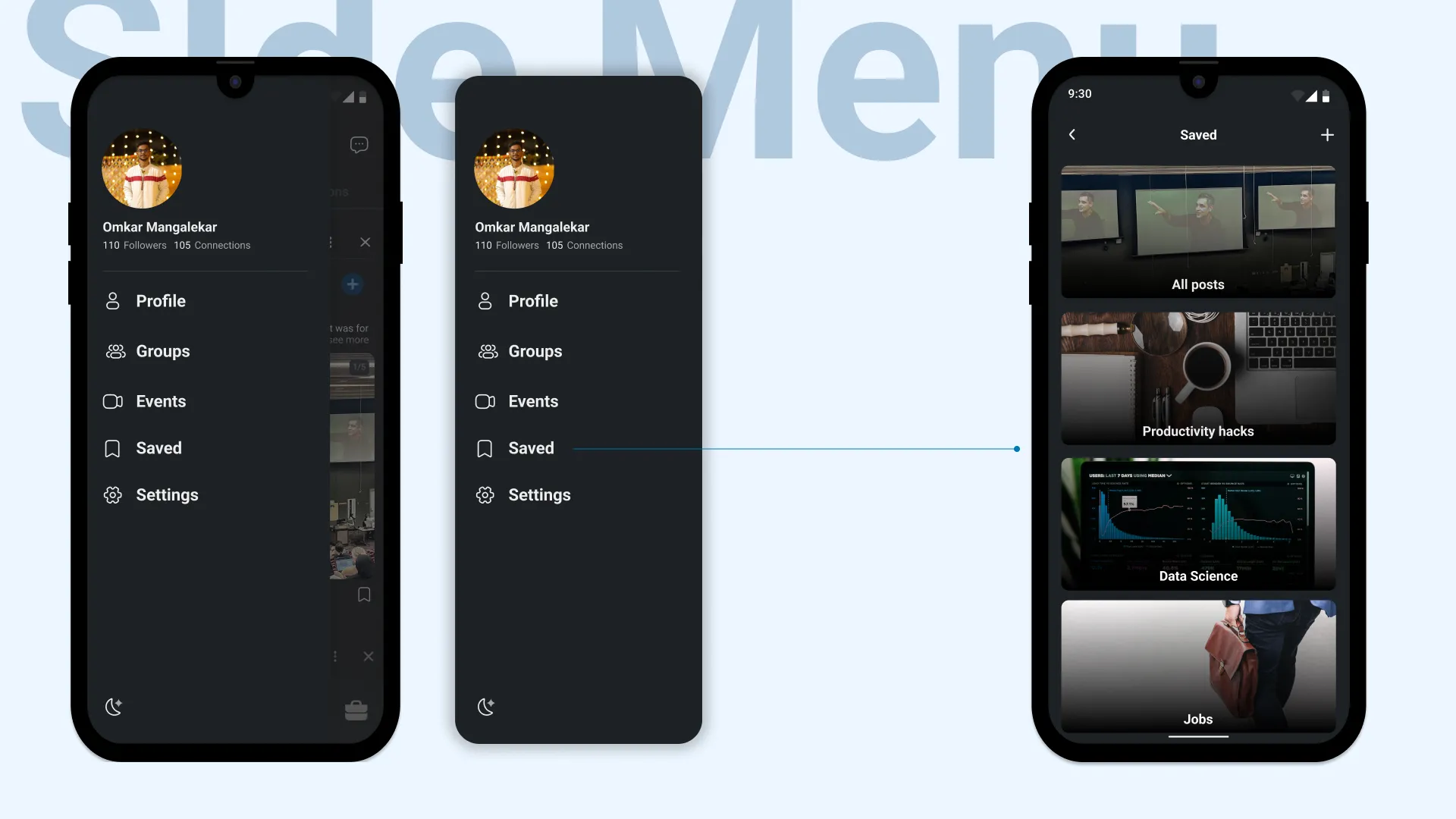
Now we come to the point where it all started. The Saved option. Finally added “ Saved ” to the side menu. Also added Events and Groups which were difficult to access previously. After saving a post, people can now put it into a folder which makes it easy to reach. Take a look at it…
Secondly exploring content or people etc. was not easy. So introducing the Discover feature was the right path I thought. Here is how it looks…
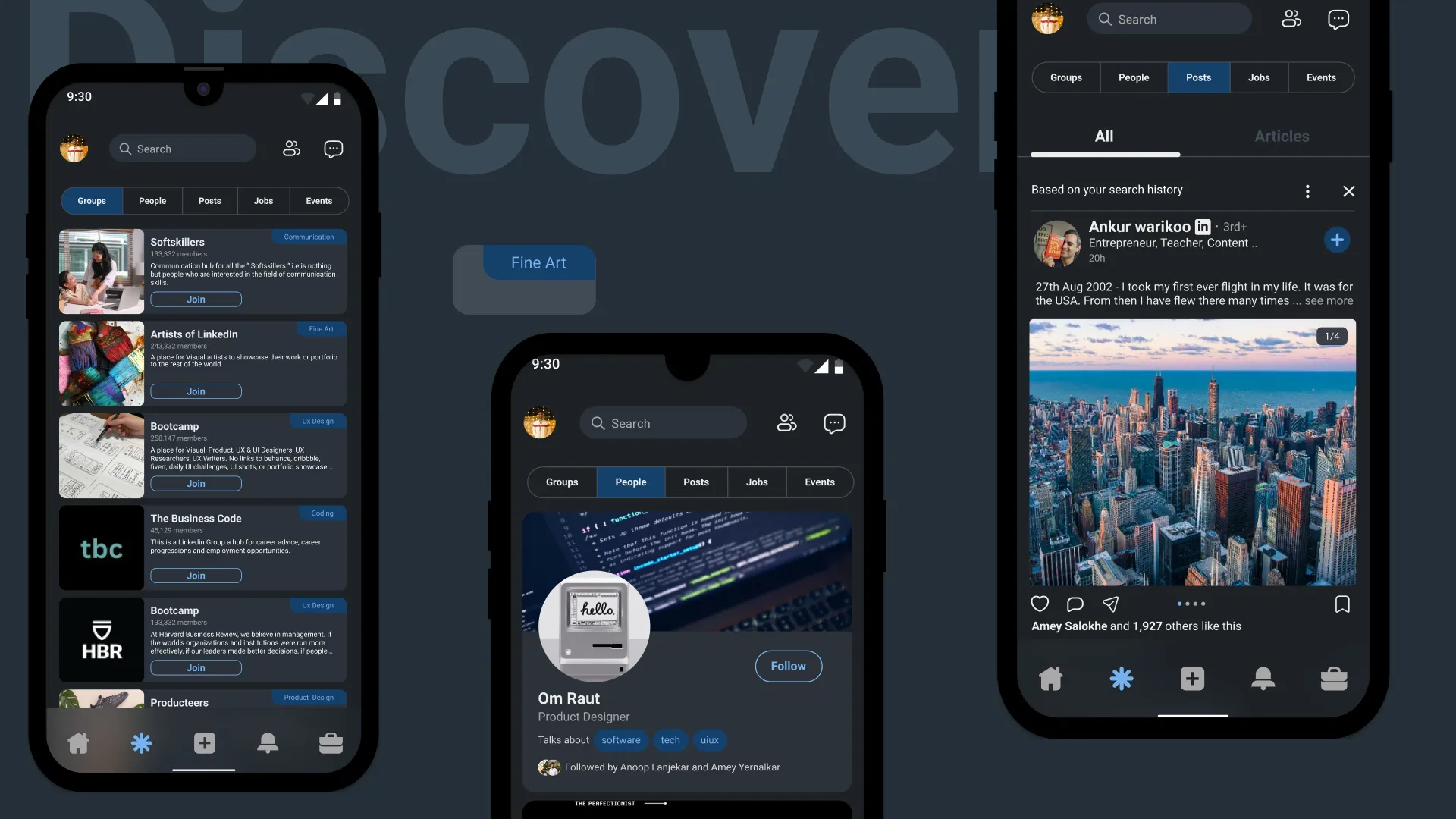
The new group card includes the interest about the group is all about. Mentioning it in the card itself makes it clearer to the user what the group is about.
For people cards, instead of using hashtags, I used chips which increase its readability and communicate better. Here I followed the Gestalt principle.
Gestalt principles highlight how users naturally group similar or proximate elements when scanning.
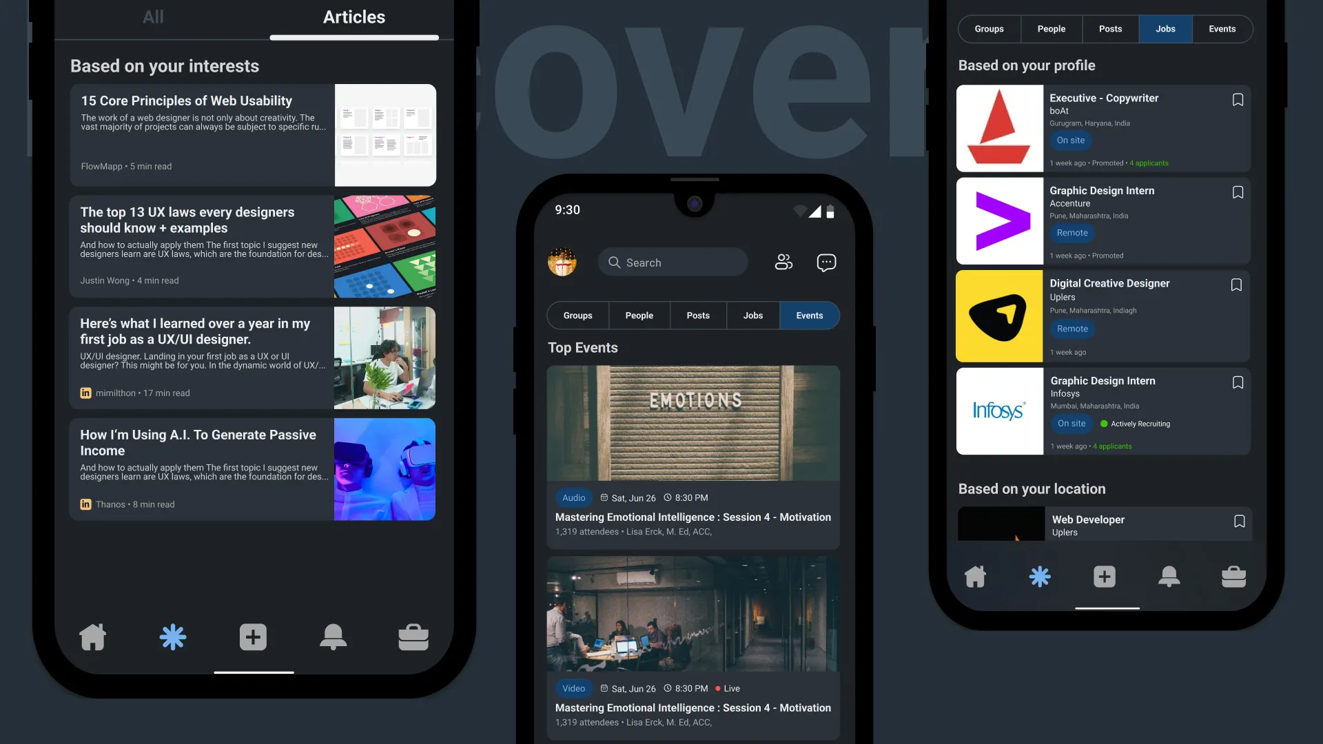
3. As found in user research articles weren’t discoverable easily hence, I added an independent sub-tab for the articles in the posts tab.
Premium Articles: From the business point of view, monetizing articles would increase the revenue of LinkedIn. Also, endorsing LinkedIn’s Top voice members to write premium content would lead to more conversions.
Visible information: See at a glance whether an event is audio or video so you can plan your attendance accordingly. Adding icons to the cards also made it more efficient to communicate information related to it which was missing earlier.
Type of job: While Considering the job, one of the main aspects is the type of job ( Remote or On-Site) which was not found in earlier versions. Also added a one-tap save option to the card to make it easy to save.
Moving on to the notification page…
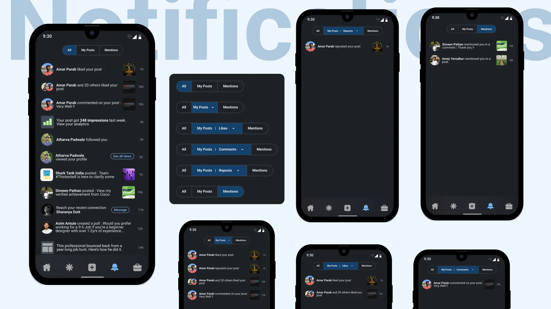
Keeping the navigation in mind, made it in the type of segmented buttons which are mentioned in Material Design 3. There was lack of a consistency in earlier notifications fixed it by standardizing a notification format by showing the time of the notification at the right followed by a thumbnail.
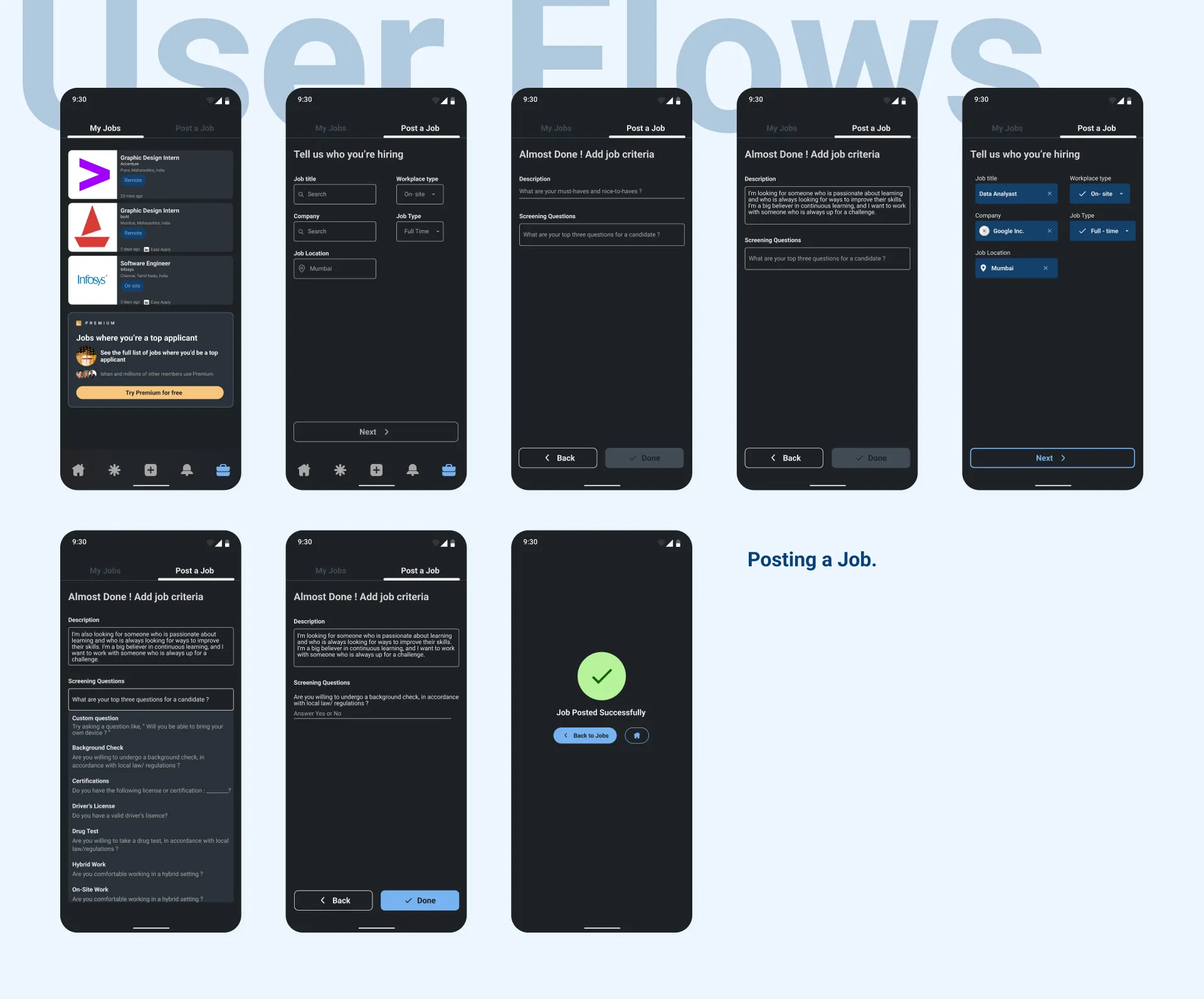
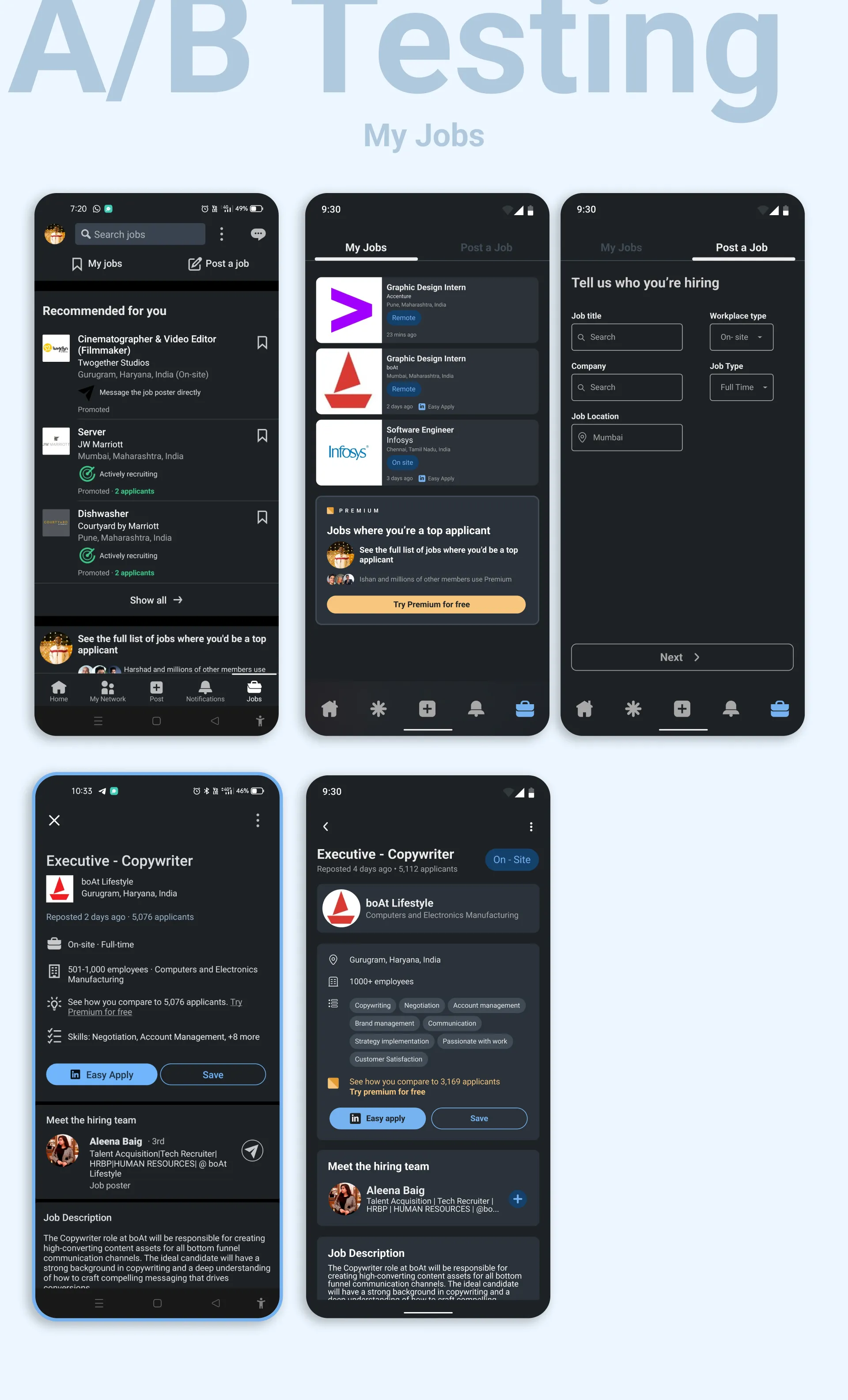
Next comes the My Jobs screen…
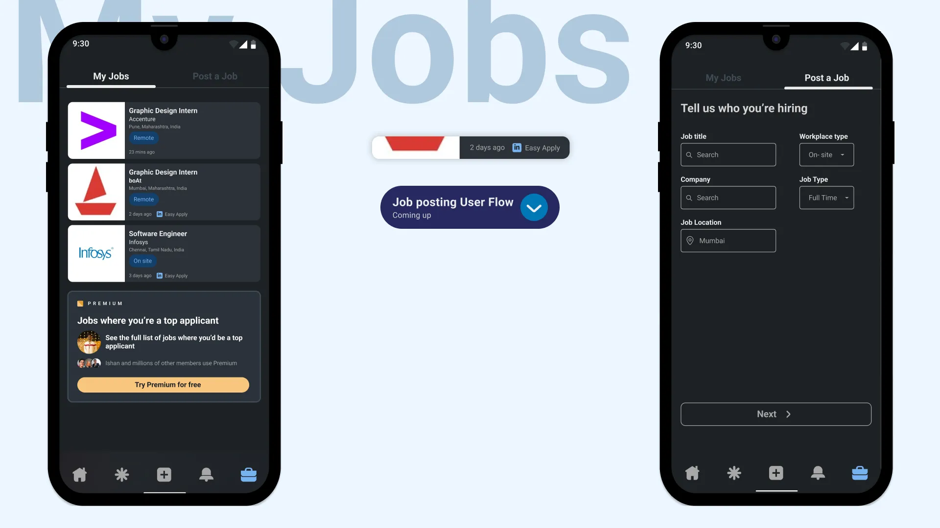
Again divide this screen into Saved Jobs and Post a Job which makes it easier to choose a flow. I think this is also the right screen to add an upsell trigger which may lead to conversion as it creates curiosity. And for posting a job I just made it easier to read. Nothing much.
The profile screen was also one of the cluttered screens. I experimented by introducing sections of information with consistent spacing.
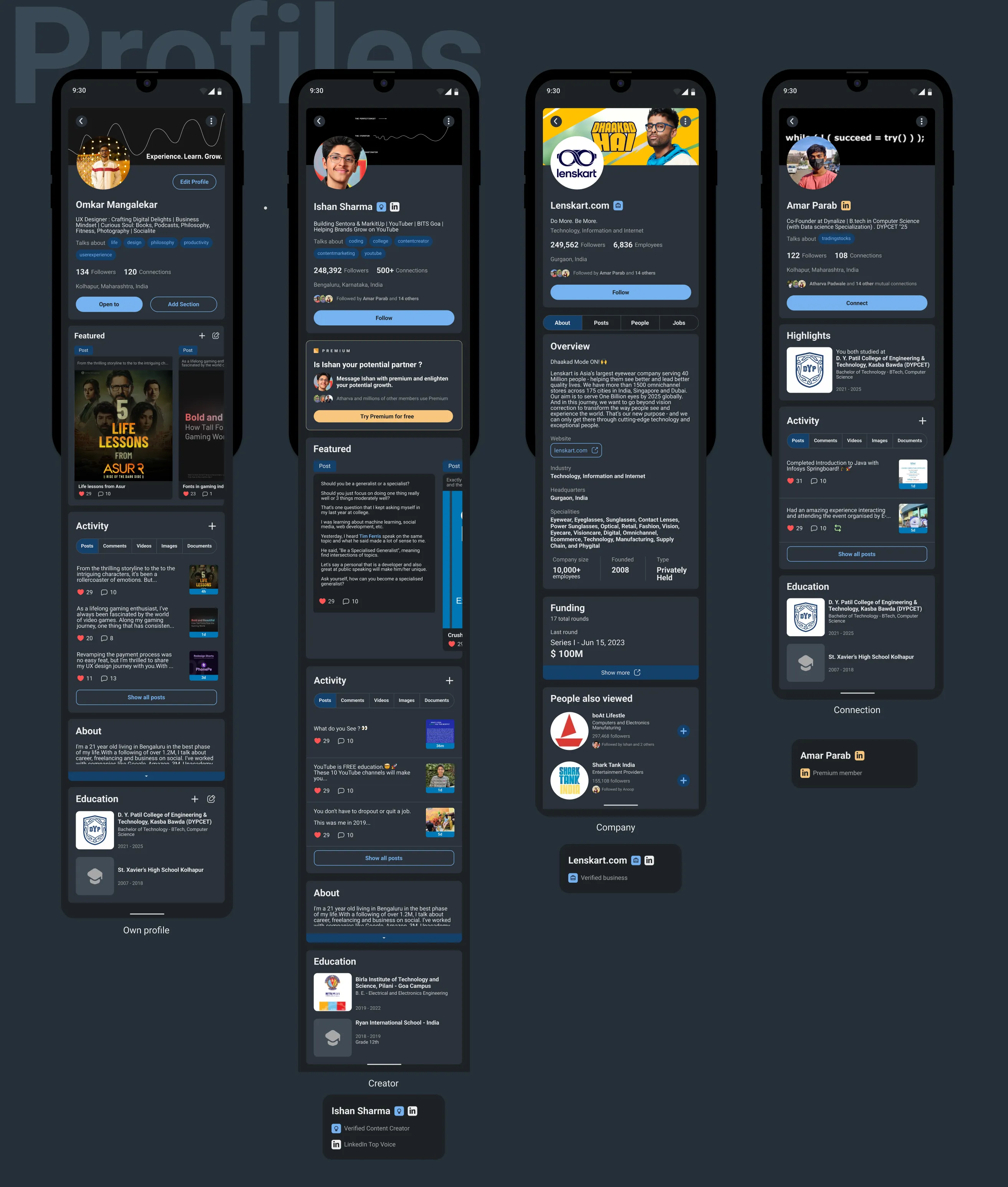
Aesthetic Usability Effect : This principle suggests that users perceive aesthetically pleasing designs as more usable and user-friendly.
User flows
- Job application for a new job which was discovered through the new Discover feature.
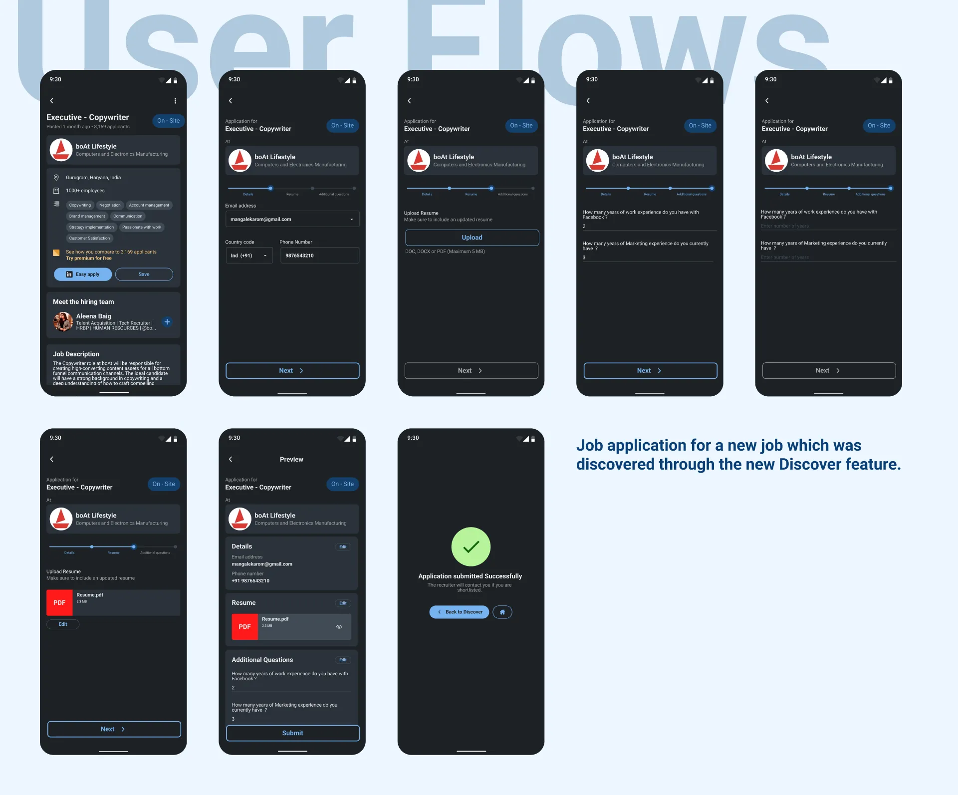
Left to right
Posting a job
- Added important information like the type of the job and role of the job which was lacking in the older version.
Searching a profile
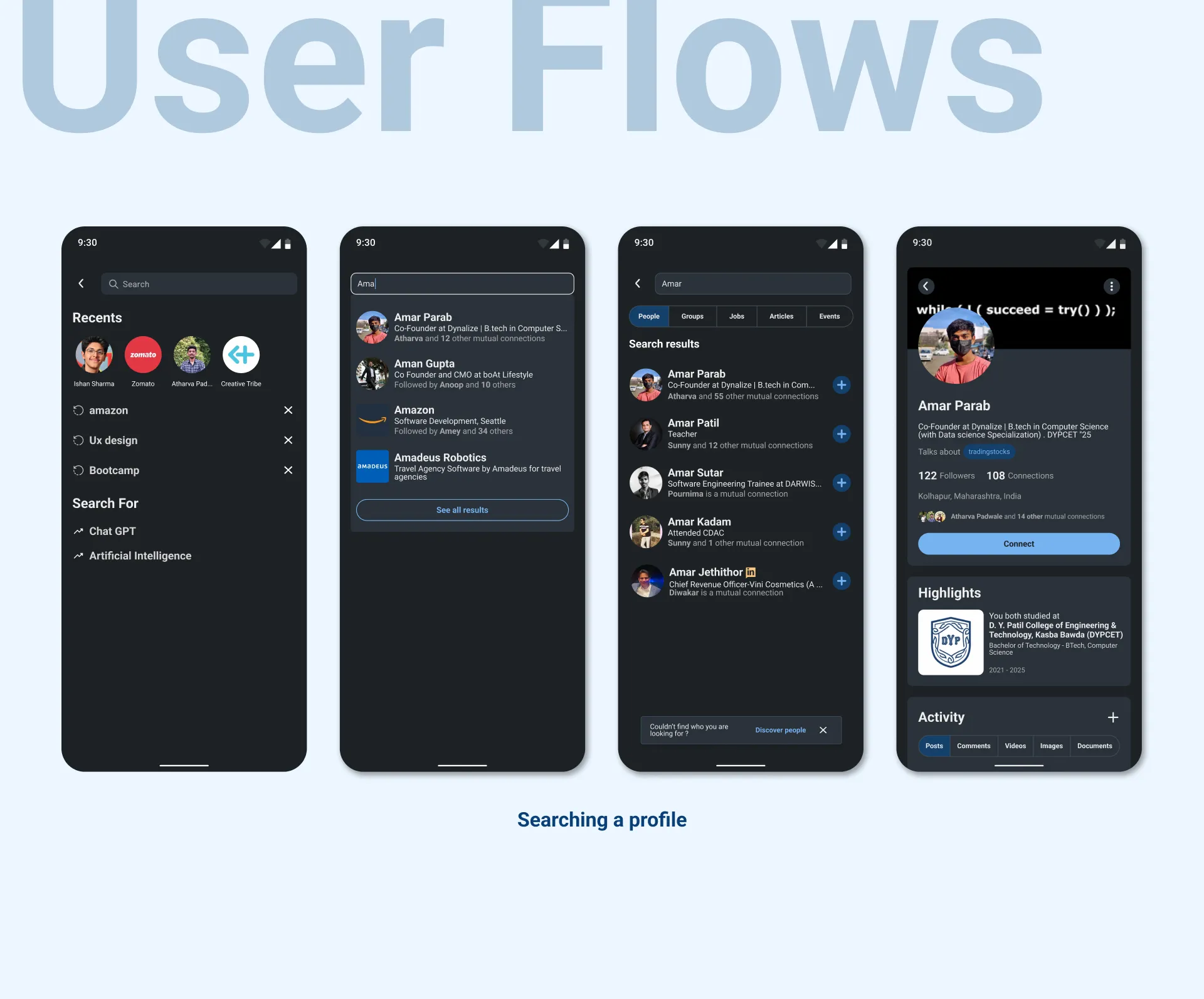
Why don’t you try it yourself?
Prototypes like a sketch or a mock-up, but more functional. Think of it as a playable version of your idea, minus all the bells and whistles.
The goal of a prototype is to test your ideas with real users and get their feedback. It’s not about making something perfect, it’s about getting something out there so you can learn what works and what doesn’t.
Now we come to the last part.
A/B Testing
Those who don’t know do not panic it’s just a comparison of the older and redesigned app keeping them side by side.
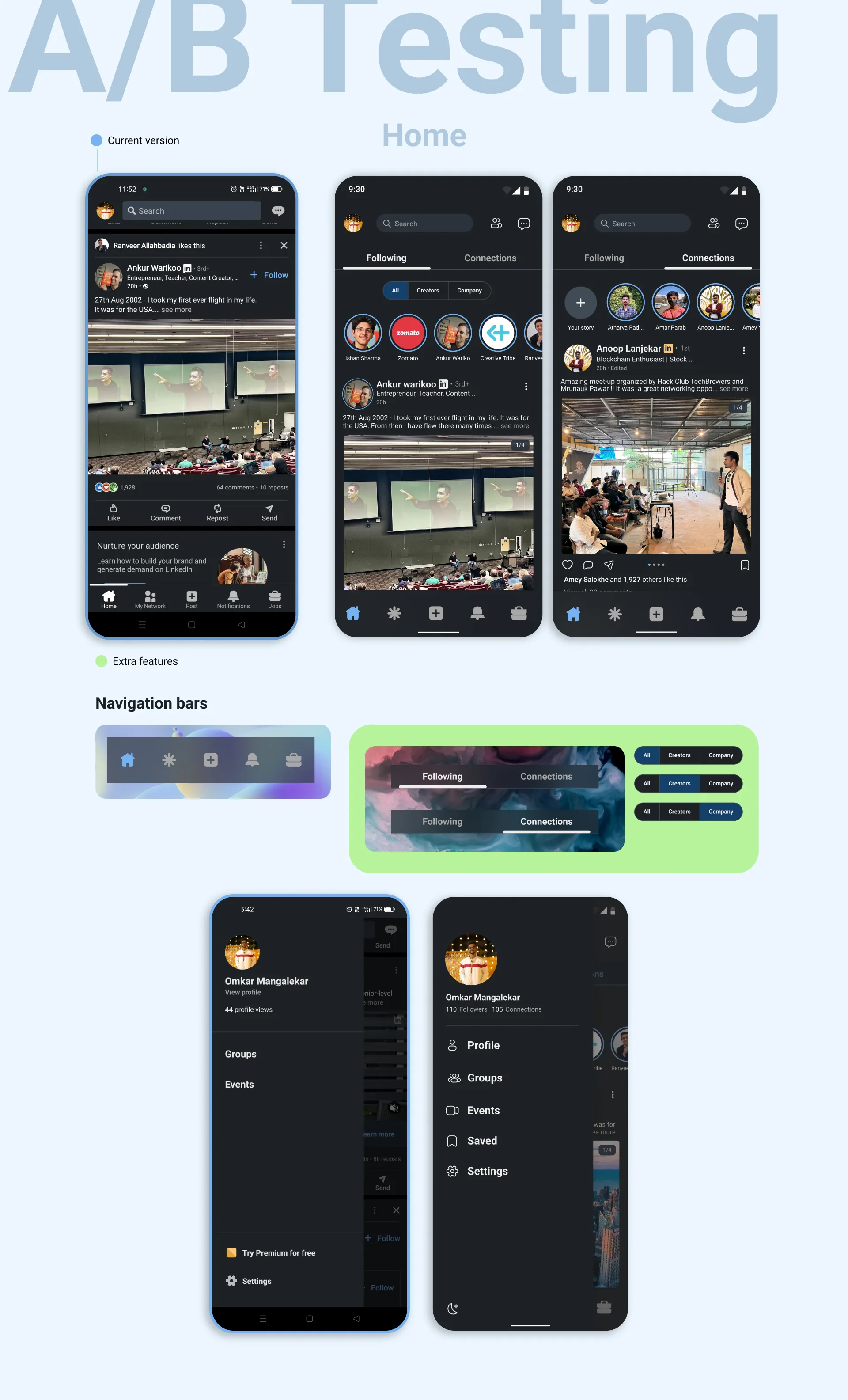
Firstly I focused on navigation bars as it’s the main aspect of functioning. Added a modern video to the navbar with the use of Glassmorphism.
Next, I added the basic options that should be in a side menu.
Hopping to notifications…
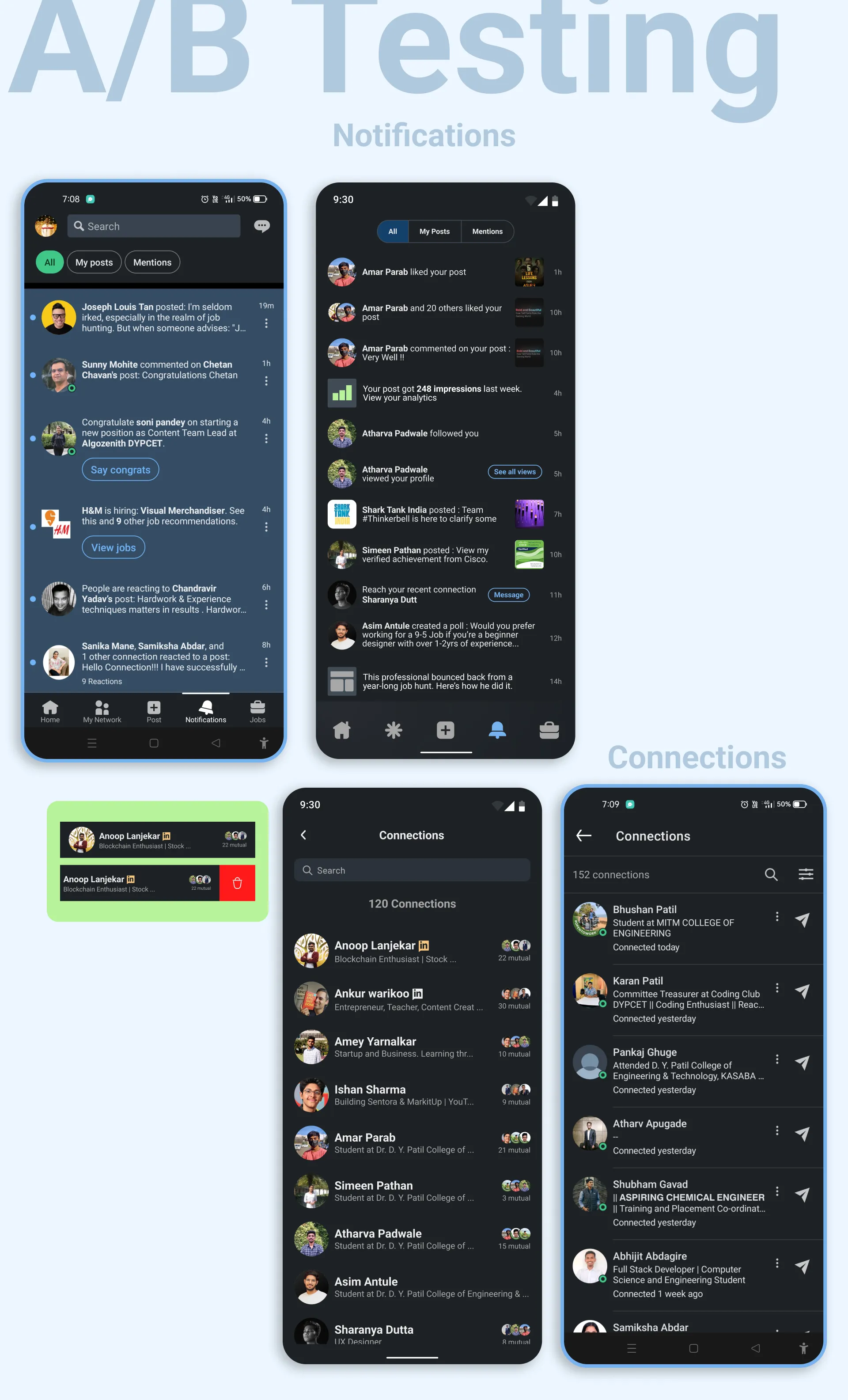
In the connections screen, added a gesture to remove a connection which makes it easier to manage connections. Displayed mutual connections after the names of each person to know to whom they are connected.
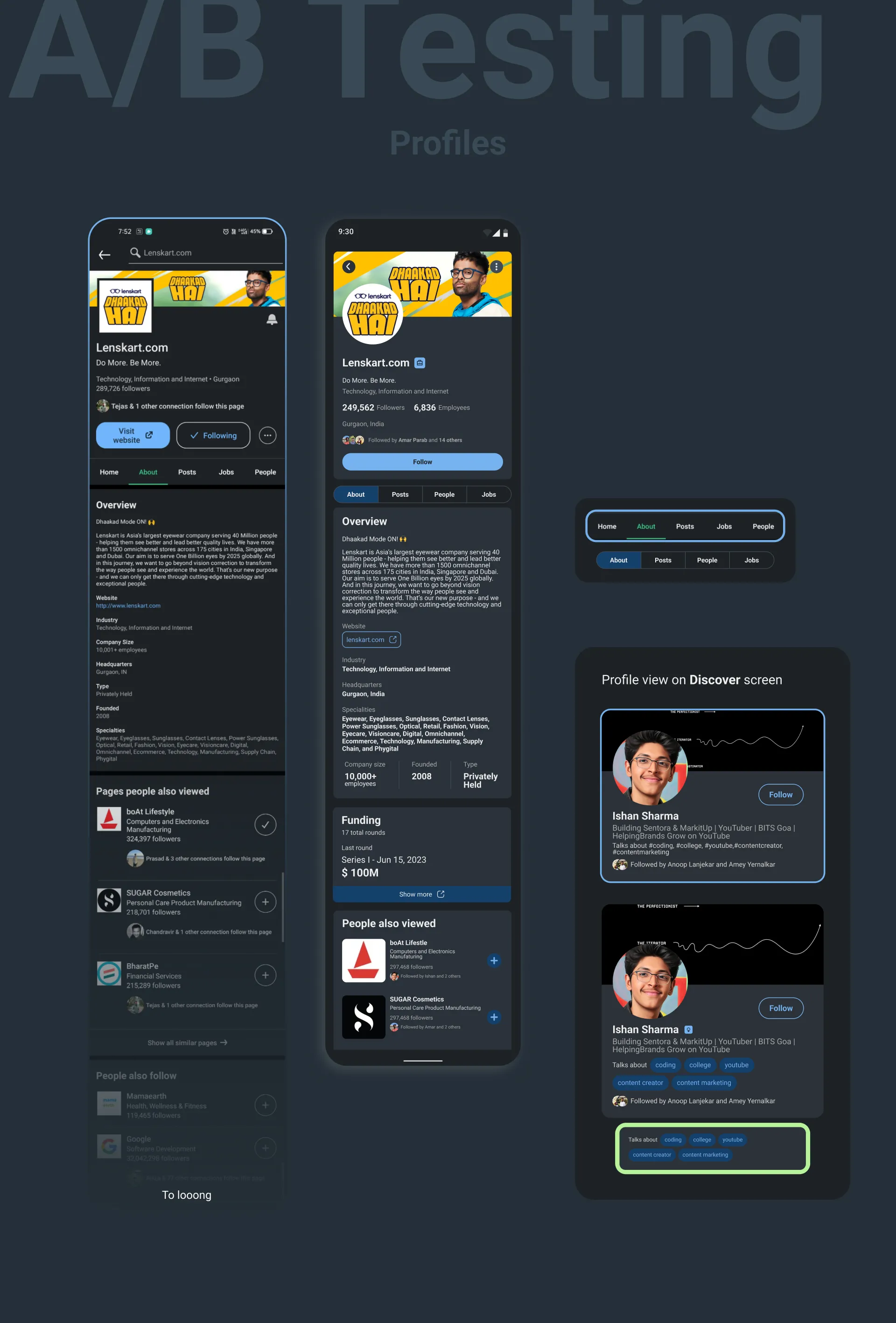
In the Company screen, I opted to remove the home section as it had similar information to that of the About section and also was more crowded.
For the profile card, I added chips replacing hashtags. Not replacing literally they’ll still take input as hashtags but show them in a chips style making it less cluttered.
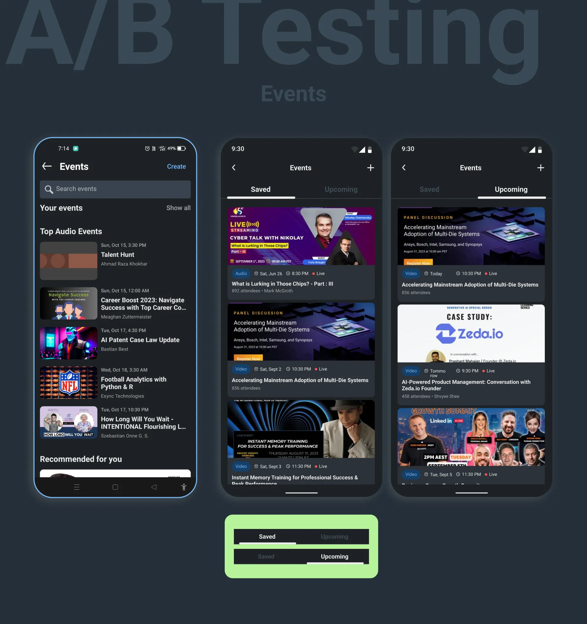
Upcoming events keep track of your events and notify you before the event starts.
Appreciation
In today’s busy world, it’s rare to have someone’s valuable time. I appreciate you taking the time to read here. May your days be filled with joy, and may your dreams come true.


